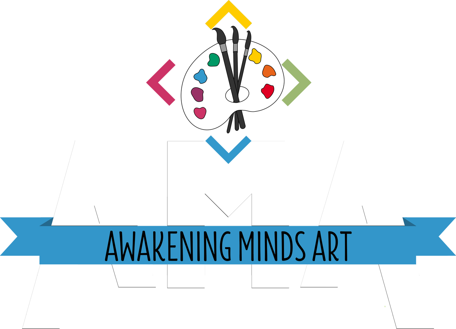

THE AMA BRAND
Name usage
Awakening Minds Art should always be said and used in full unless the situation/document allows for abbreviation to be used for casual tone.
AMA can be used when appropriate, but only after stating “Awakening Minds Art (AMA)”
Mission
Our mission is to provide therapeutic, educational & developmental programs to all ages & abilities, empowering individuals to build functional everyday skills and confidence. (est. 2009)
Vision
Our vision, at Awakening Minds Art, is to create affirming, all-inclusive spaces where people have the confidence to develop into the best versions of themselves. Awakening Minds Art works towards building skills that help people not only feel successful within our community, but to be successful throughout their lives.
LOGO Usage
Logos should never be skewed or altered in any way.
MAIN LOGO (BLACK AMA)
Used by default in most situations – with background removed, no box outline or any other modifications
MAIN LOGO (WHITE AMA)
Used by default when the background is dark – with background removed, no box outline or any other modifications
TAG LOGO
Used only when the MAIN LOGO has already been represented or when space is extremely limited. The pallet should remain white no matter the color of the background.
When possible, “Awakening Minds Art” should be used near the tag logo.
COLOR FAMILY
Black
White
Yellow:
R: 254 G: 203 B:2
C:0 M:20 Y:99 K:0
Hex: #FECB02
Green:
R:138 G:198 B:34
C:30 M:0 Y:83 K:22
Hex: #8ac622
Light Blue:
3196CA
R:49 G:150 B:202
C:76 M:26 Y:0 K:21
Orange:
R:232 G:100 B:27
C:0 M:57 Y:88 K:9
Hex: #E8641B
Magenta:
R:204 G:51 B:102
C:0 M:75 Y:50 K:20
Hex: #CC3366
Purple:
R:111 G:48 B:160
C:31 M:70 Y:0 K:37
Hex: 6f30a0
FONT FAMILY
Impact not bold: headlines
Calibri Body: common text font
Chocolava: all graphics in studio, added to text documents for fun and emphasis, headers etc. (should be used when size is flexible)
Ink free: used to indicate casual tone, use when there is a desire to express familiarity.
FLORENCE REGULAR: ALWAYS IN ALL CAPS, USED IN LOGO
Lilly Belle: backup to Chocolava, when Chocolava doesn’t work, is hard to read or is too small
